Brand Identity for NYCDocs
-
NYCDocs is an extended primary care facility in the Bronx, NY. Last year, I helped them with their new brand identity. They wanted to go for strong, bold, healthcare-esque look. But they also wanted something that would stand out.
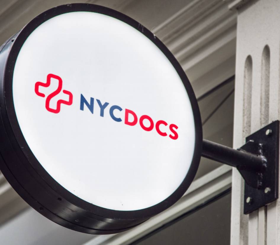
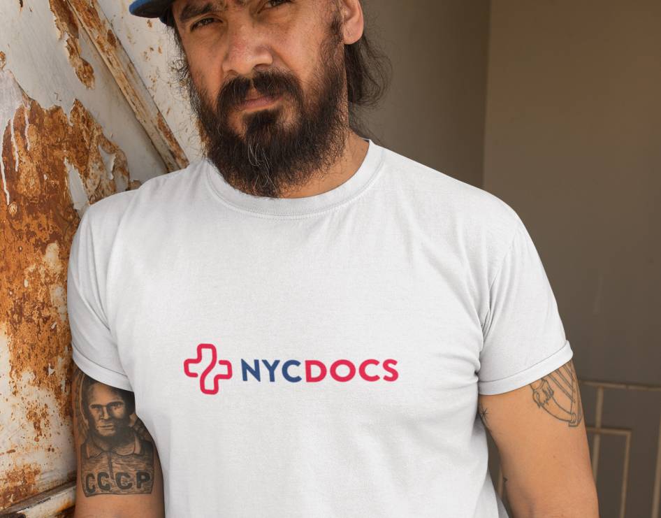
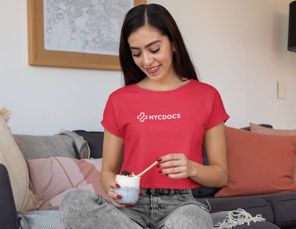
After analysing the target audience and doing the market research, I started developing variants in different types of logos: wordmarks, lettermarks, combination marks, and symbols. The important factor to consider was the high readability of the logo. It needs to work as an app icon, on signage, on photos, on top of arbitrary colors, etc.
The process was wonderfully iterative. Here’s some initial ideas that didn’t make the cut: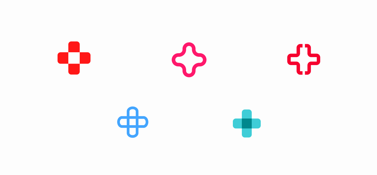
It was clear that client wanted plus-symbol somehow incorporated on the logo. So I started developing some ideas around it. After few more iterations, I found my eureka moment.
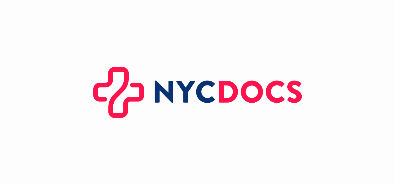

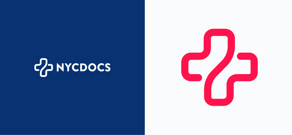
The logomark subtlely illustrates healthcare space while remaining bold and identifiable. Medical group stakeholders loved and locked it. Here’s some snippets from the brand identity presentation: